 |
| click to see larger image! |
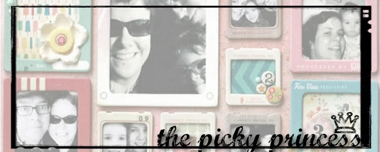
I was very fortunate to have this page published in Canadian Scrapbooker Magazine this past issue. I used some of my favourite products (Finnabair's line with Prima, Distress Ink, Julie Balzers' masks and Studio Calico). Almost all of it was purchased at local Scrapbook Store, Bizzy B's.
Here's what works:
-Pattern on pattern: I used to shy away from this but I've found grouping large and small patterns together create interest. The large inked design doesn't compete with smaller more neutral pattern on the background. Many pieces of pattern paper have an "A" side (larger, bolder patterns) and a "B" side (neutral, smaller scaled patterns) and are meant to be used together. Working with collection packs can help learn to group your patterns together effectively.
-A solid frame around the photos gives a clear demarcation between the patterned paper and the photos. This helps draw the eye to the bold colours of the photos that are the focal point.
-Visual triangle: I'll be covering this design element in a post to come but placing elements in a triangle formation helps lead the eye around the page. It's pretty easy to do with embellishments.Both the metal embellishments and the feathers are grouped in a triangle formation leading the eye to the focal point of the photos.
Here's what doesn't work:
-lack of straight lines: I have a very bad habit of not checking if my linear elements are straight or not. Next time I will use my T-Square ruler and line everything up with edge of the page.
- I find the photo strip in the top third of the layout makes the layout feel too top heavy. Usually, I place my large groupings of photos on the bottom third and I decided to change it up this time. I think I will stick with my "go to" placement next time.I hope this post has helped your scrapbooking just a little!
1 comment:
I like the film strip in the top third!
Post a Comment